“Leyendo” is an app designed to teach reading in Spanish, primarily aimed at users who are learning the language.
The Problem: Immigrants hope to improve their language skills, but some don’t have much time to devote to reading practice.
The Goal: To design an easy-to-use app that enables users to carry out their learning from various locations and adapt to their available time.
My Role:UX designer responsible for designing the main user flow screens from start to finish.
Responsibilities: Conduct interviews, create wireframes both on paper and digitally, develop low- and high-fidelity prototypes, perform usability studies, ensure accessibility, and iterate on designs.
Duration: 1 month.
Understanding the User
I began my research by interviewing users and creating empathy maps to better understand their needs. The results revealed two main user groups: one made up of adult immigrants who work, and another of people still attending compulsory education. The main challenges identified were the importance of time management and the need to continue learning in different locations.
Persona 1: Omar
Age: 17
Education: High School
City: Rabat
Family: Padres y hermanos
Occupation: Student
«I want to be able to interact with my peers more easily»
GOALS
To read better in Spanish so they can continue their studies.
To improve their reading and writing skills to communicate with friends on social media.
FRUSTRATIONS
Reading lessons may not always be engaging.
Learning to read at school takes time away from other subjects.
Omar is a student originally from Morocco who recently moved to Spain with his family due to his parents’ work. He needs to learn Spanish. At his new school, they are teaching him the language, but sometimes he finds it tedious. He would like to learn to read in an easier way so he can continue the exercises at home.
Persona 2: Li Jie
Age: 36
Education: University
City: Chengdu
Family: Wife and Daughter
Occupation: Construction Worker
«The earlier I learn, the sooner my situation will improve»
GOALS
To read and express himself better in Spanish in order to pursue his profession.
Use his break time effectively to keep learning.
FRUSTRATIONS
He has limited time available for studying.
It’s difficult to figure out where to begin studying.
Li Jie is originally from China and recently moved to Spain with his family. He has education and experience in the sciences, but although he can speak some Spanish, he needs to improve his reading and writing skills to advance his career here. Meanwhile, he works as a laborer and doesn’t have much time to study. Therefore, he would like to make the most of his breaks at work to keep learning.
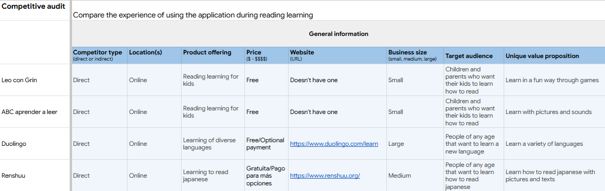
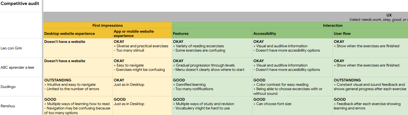
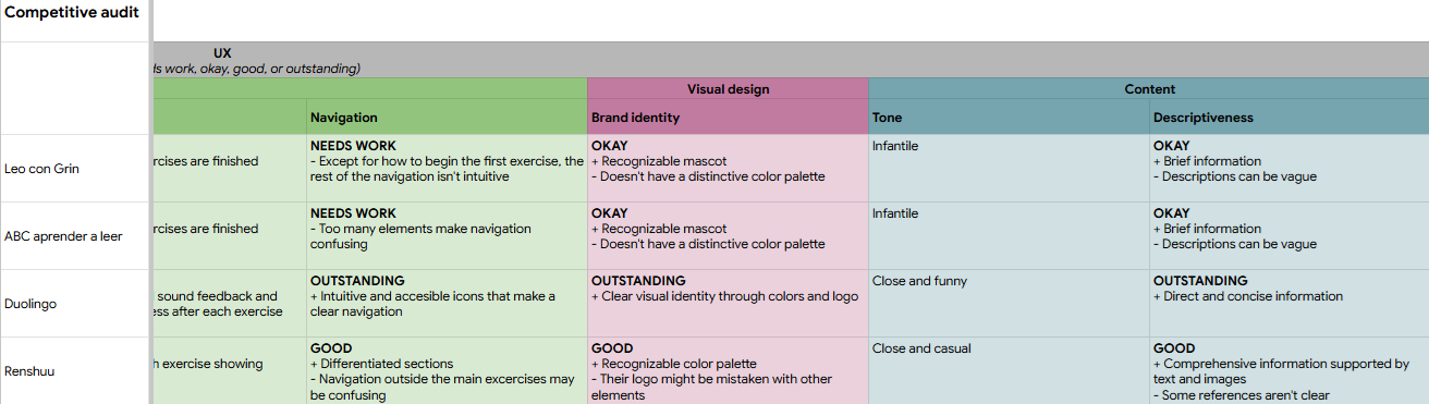
Competitive Audit
In addition to user research, I conducted an audit of some competitors' products to observe best practices and identify opportunities for improvement in the design of our application.
Starting the Design
Ideation
With all the information gathered, I conducted a quick ideation exercise based on the identified needs, paying special attention to the app’s ease of use.
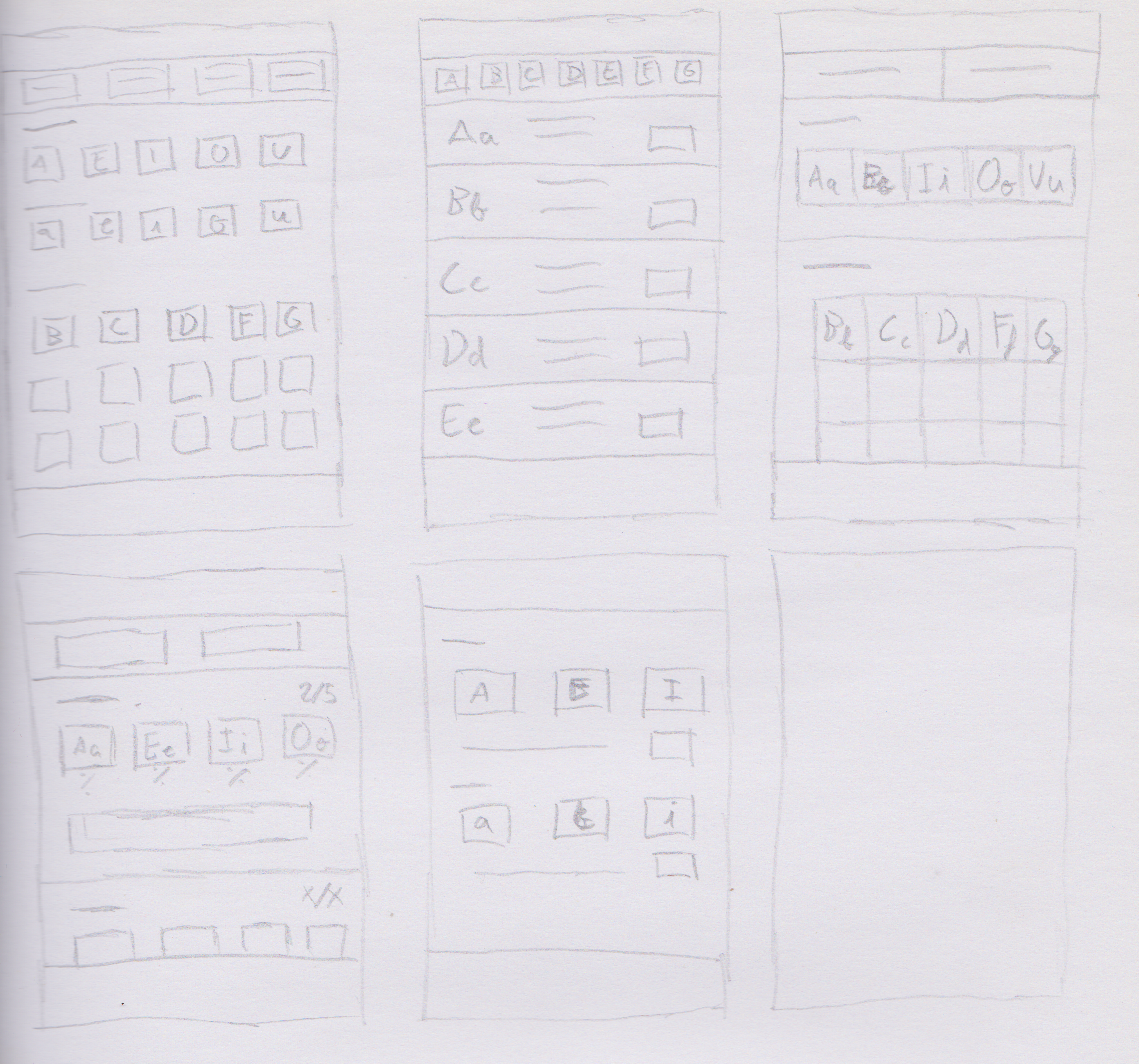
Digital Wireframes
After ideating and sketching on paper, I created the initial digital wireframes for the reading app.
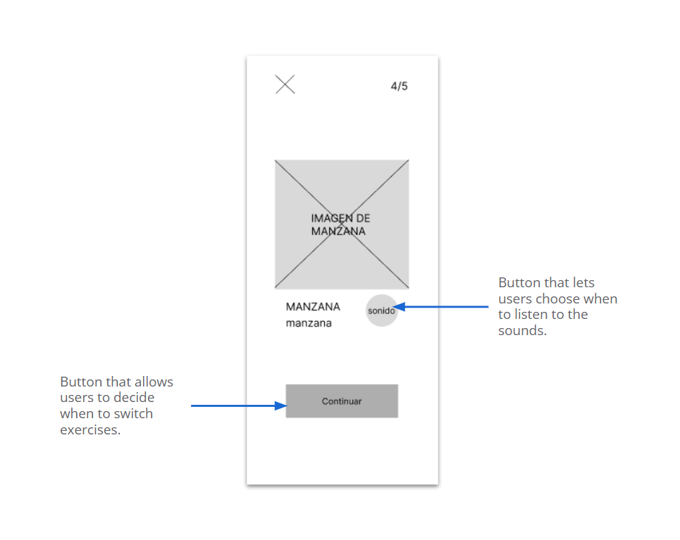
Low-Fidelity Prototype
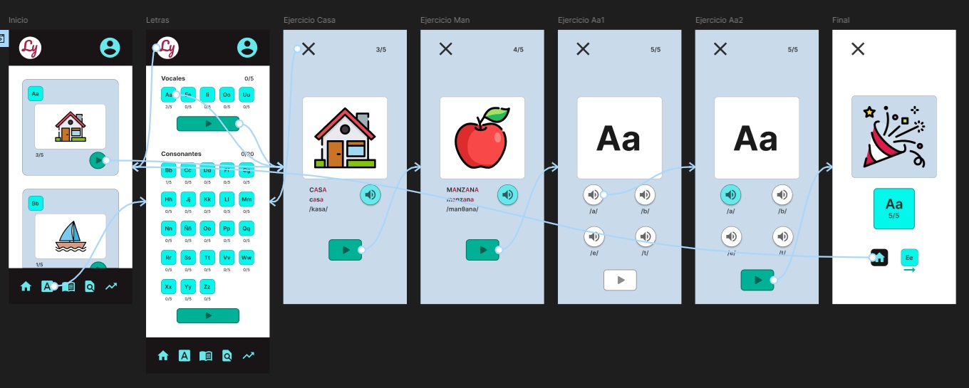
Using the digital wireframes to conduct a usability study, I created a first low-fidelity prototype for the main user flow.
Sound:Users need alternatives to sound in the exercises.
Rythm:Users need the ability to resume exercises seamlessly.
Numbering:Users need to clearly see what the numbering indicates.
Refining the Designs
Mockups
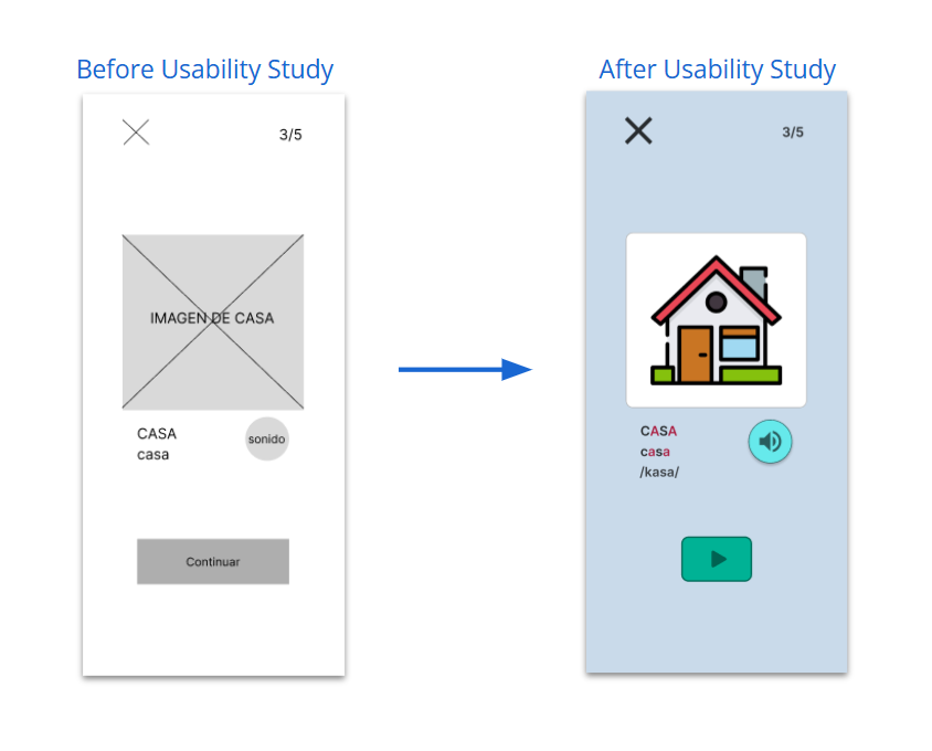
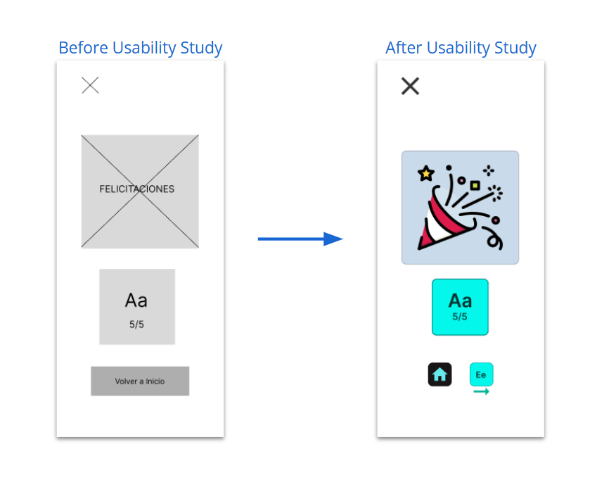
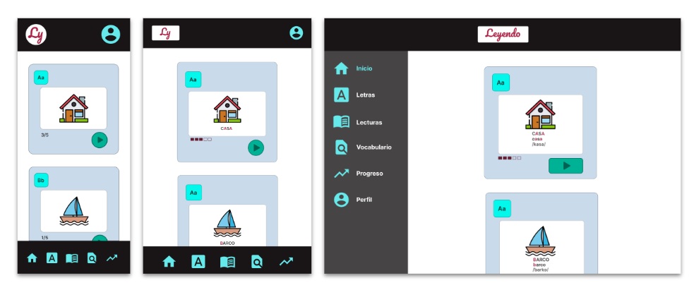
Based on the conclusions of the usability study, changes were made such as displaying the phonetic transcription of sounds for cases when they cannot be heard.
Additionally, changes were made such as providing the option to return to the home screen or continue learning the next letter.
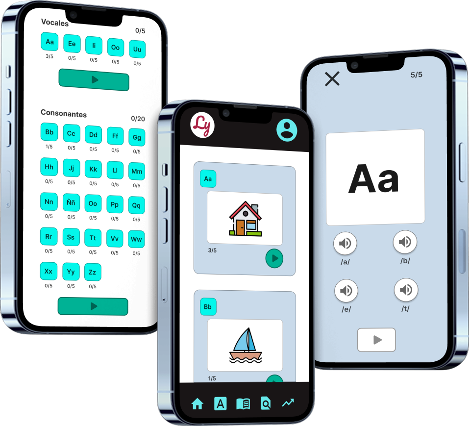
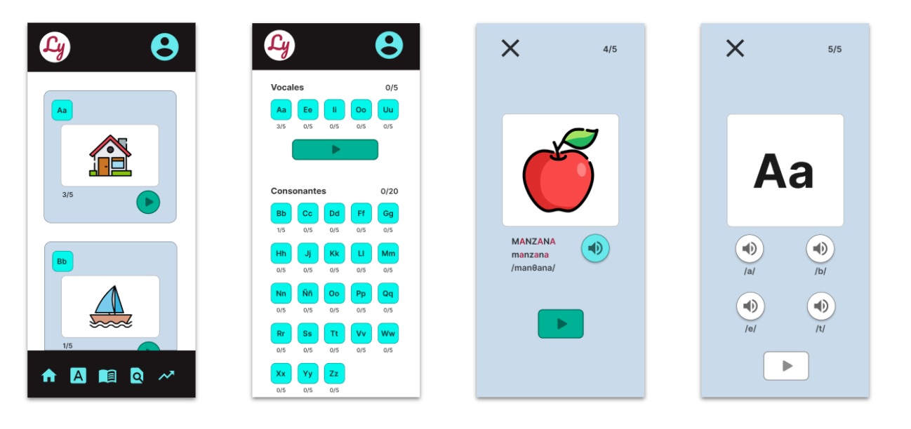
High-Fidelity Prototype
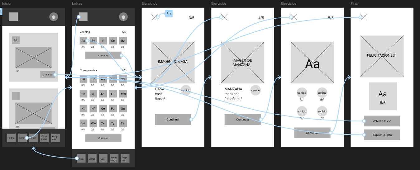
The high-fidelity prototype followed the same user flow as the low-fidelity one, updated with the proposed design changes.
Efforts have been made to minimize the use of text outside the exercises to facilitate navigation for users who are not yet proficient in the language.
WCAG contrast criteria were used when selecting text and background colors to enhance readability.
Two alternative sources of information are provided during the exercises: visual and auditory.
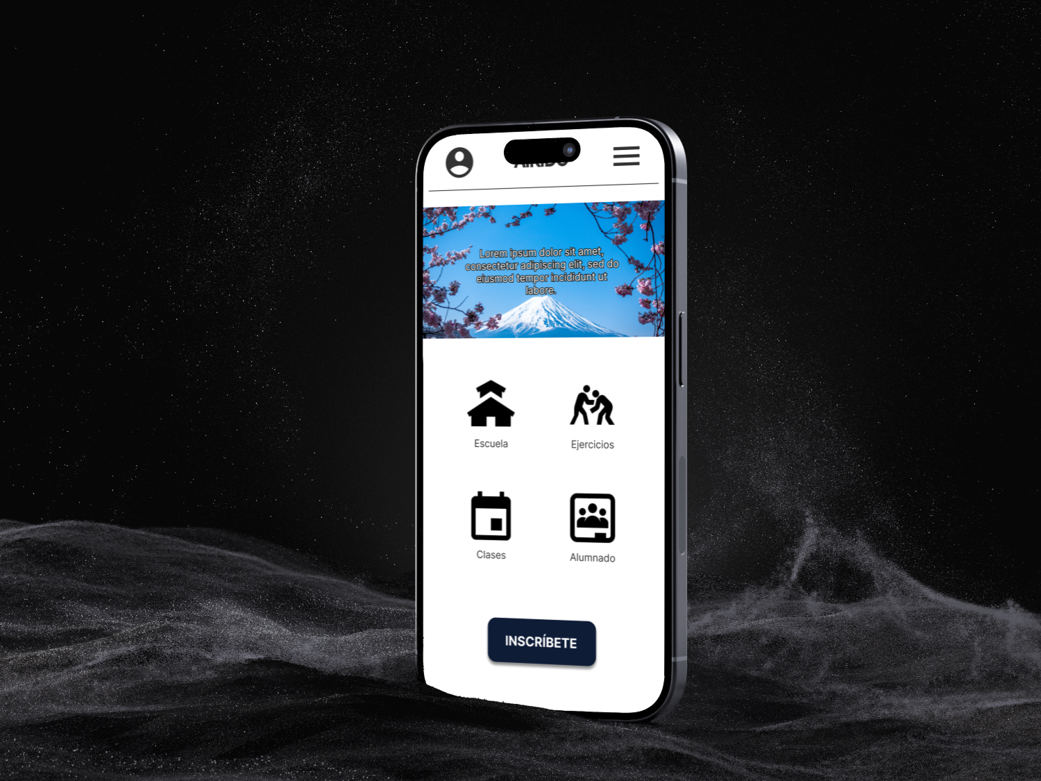
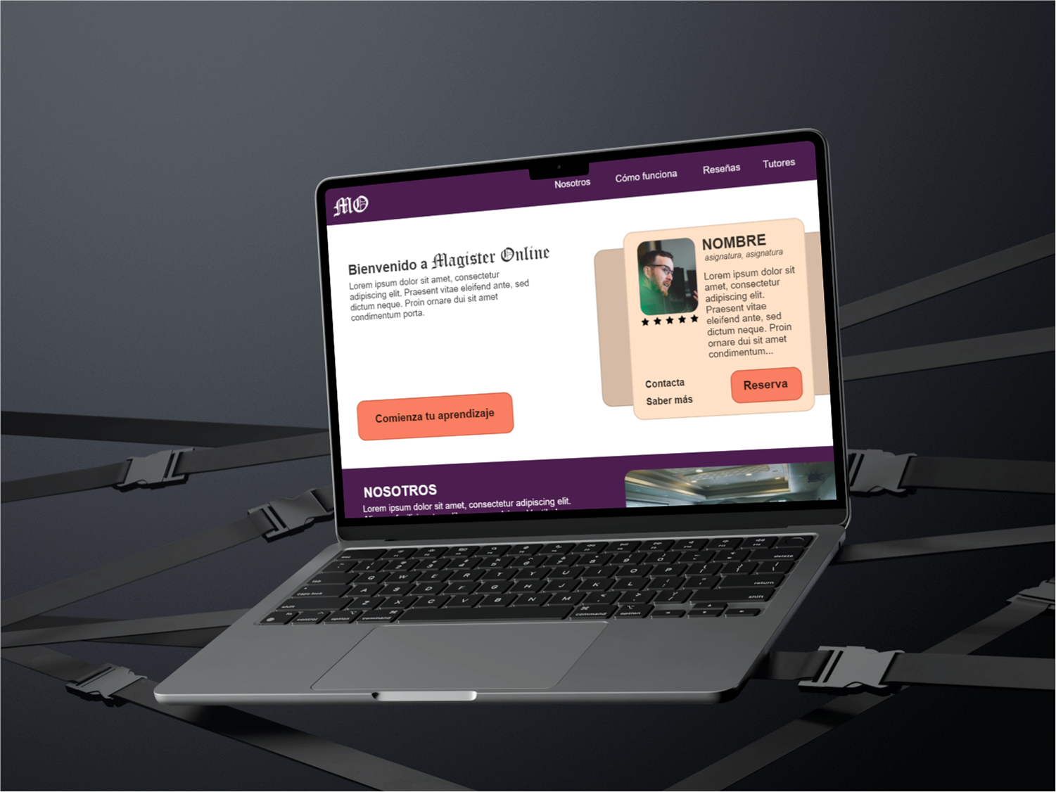
Responsive Design
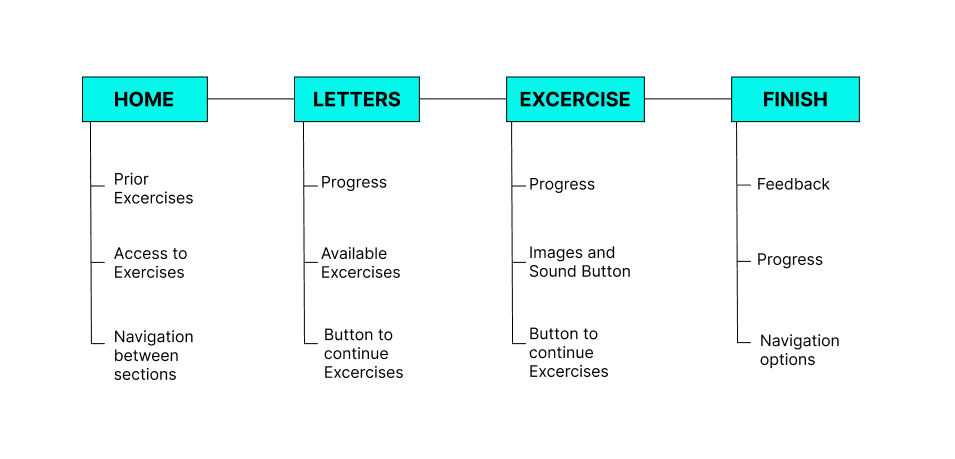
Site Map
After completing the app designs, I worked on the responsive website designs. To do this, I first created a sitemap to guide the structure and ensure consistency across different screen sizes.
Responsive Design
The designs for different screen sizes included mobile, tablet, and desktop versions, adapting the content to the specific characteristics of each device.
Conclusions
Impact:
Users mentioned that they found it easy to navigate both the app and the website. They also said it was convenient to access the exercises and continue their reading learning.
What have I learned:
One of the lessons learned from this project is that nothing should be taken for granted—even the most common elements can be overlooked. That’s why it’s important to pay close attention and continuously iterate on designs, always keeping users’ needs in mind.
Next Steps
Conduct a new usability study after the latest iterations to verify whether users’ needs have been adequately addressed.
Explore, through research, any aspects of users’ needs that may have been overlooked in previous studies.
Thank you for your attention during the presentation of this design!