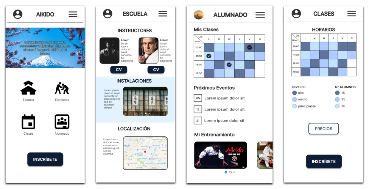
Website for an Aikido school, aimed at providing information to those interested and facilitating class tracking for students.
The Problem: People who want to start practicing martial arts often struggle to find information that helps them make informed decisions.
The Goal: Aesign a website for an Aikido school that provides relevant information and supports users in making enrollment decisions.
My Role:UX designer in charge of the end-to-end design of the school's website.
Responsibilities: Conduct interviews, create wireframes both on paper and digitally, develop low- and high-fidelity prototypes, perform usability studies, ensure accessibility, and iterate on designs.
Duration: 2 months.
Understanding the User
I began my research by interviewing users in order to create empathy maps that would help me better understand their needs. From the results, I identified a group of users who were students with little previous experience in martial arts but showed interest in them. The main issues for these users were the importance of managing their finances and the need to understand the class methodology.
Persona: Sara
Age: 20
Education: University
City: Seville
Family: Parents
Occupation: Student
«To maintain good health, it's important to take care of both your body and mind.»
GOALS
Improve their physical fitness.
Find a physical activity they enjoy.
Improve their self-defense skills.
FRUSTRATIONS
"My budget is limited."
"I like to know the class routine before signing up."
"I would like to understand the teaching approach of the classes."
"Sara is a university student studying psychology. Interested in how the mind affects the body, she would like to specialize in sports psychology. She wants to start practicing Aikido because she finds it an interesting way to exercise and improve her self-defense skills, but as a student, she is limited by her budget and doesn’t have much information."
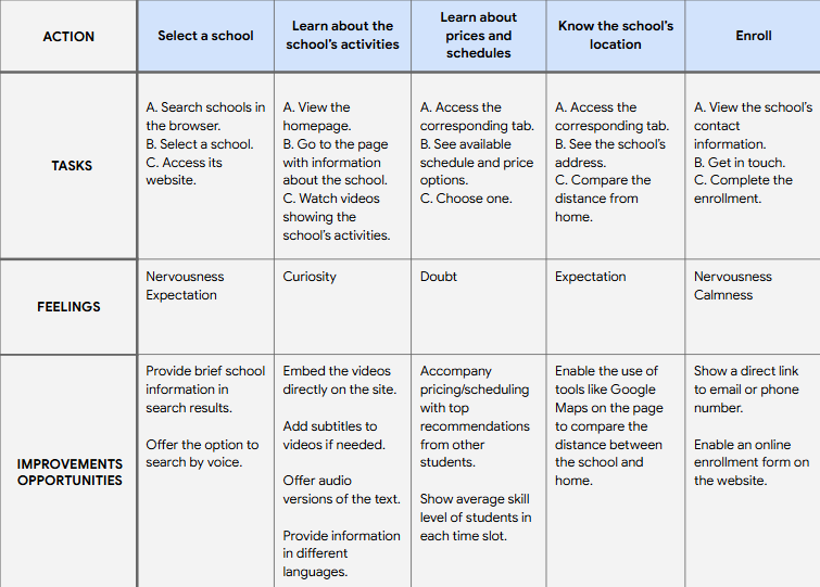
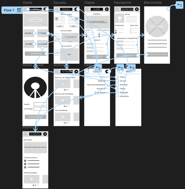
User Journey Map
Based on Sara, I envisioned how a user would interact with the website when aiming to enroll in an Aikido school.
Starting the Design
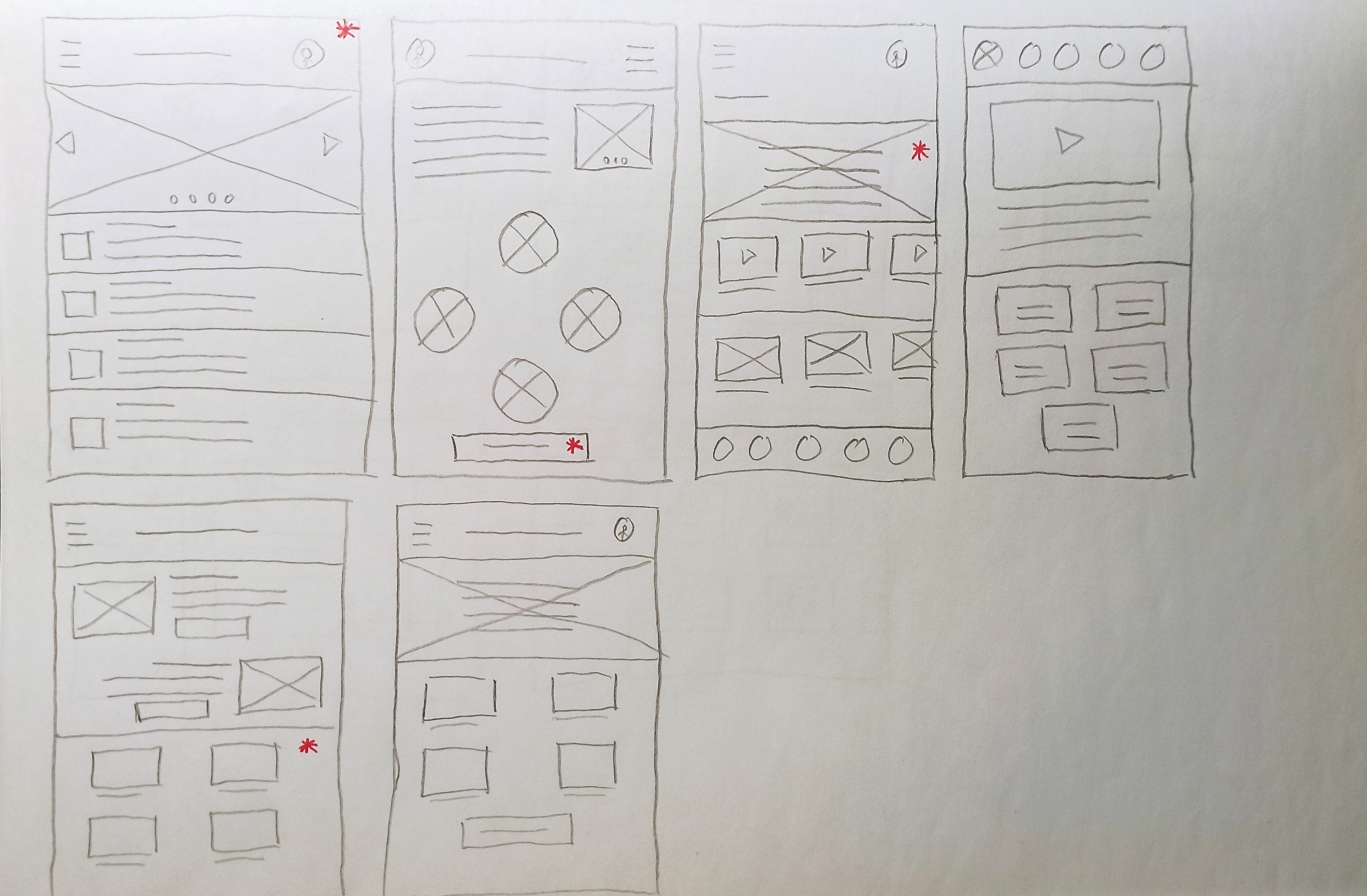
Paper Wireframes
I created paper wireframes to quickly propose designs before executing them in digital format. I chose ones that provided users with brief initial information and facilitated navigation through the most relevant sections.
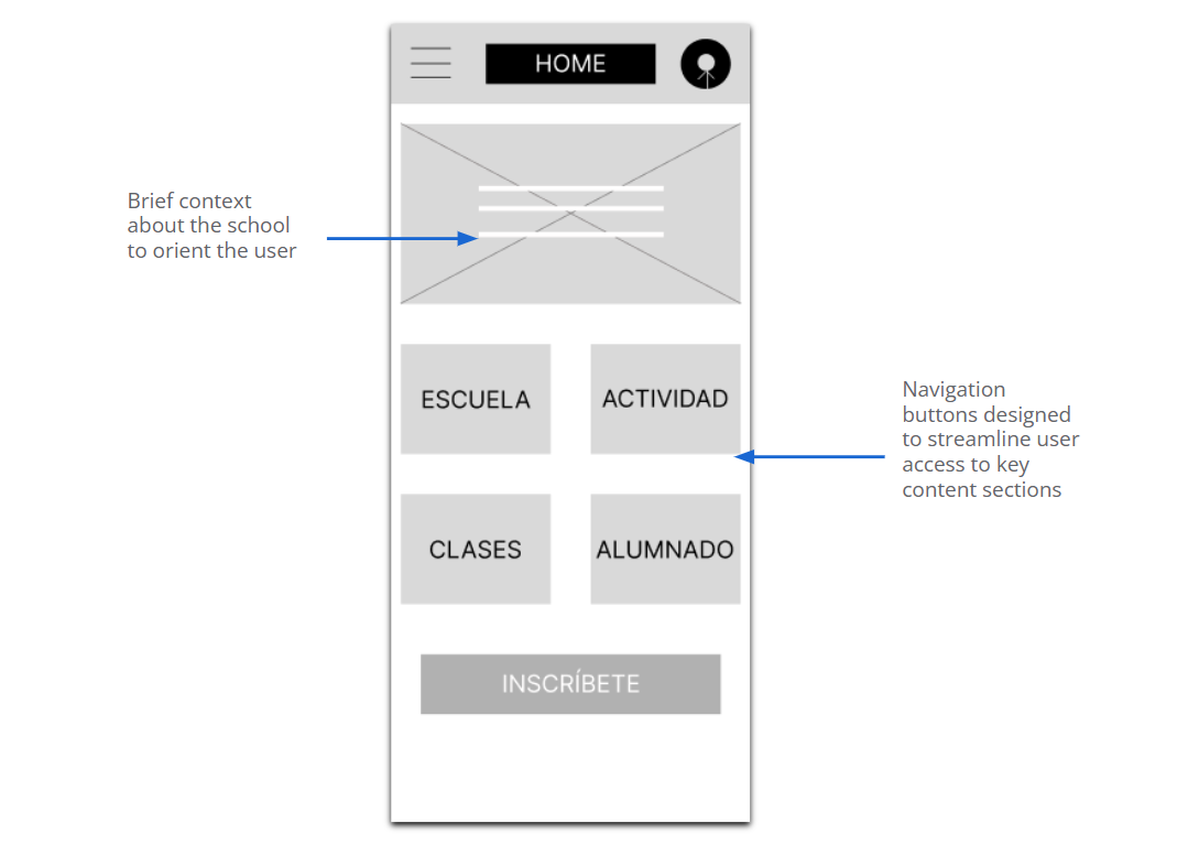
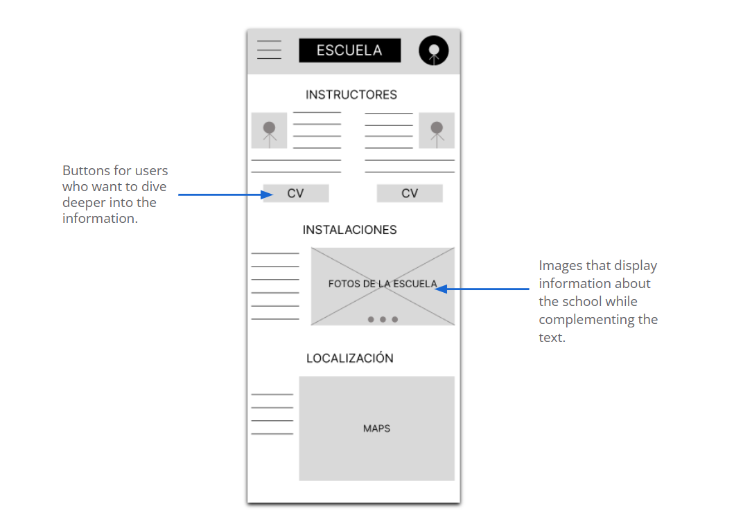
Digital Wireframes
To address users’ needs regarding information, I took into account the ease of access to it.
Attention was also given to ensuring that users could access comprehensive information about the school.
Low-Fidelity Prototype
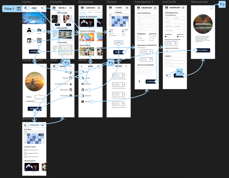
After creating the wireframes and gathering user feedback, I developed a low-fidelity prototype. The user flow I designed involved navigating through the various information pages until reaching the enrollment process.
Two studies were conducted. The first was carried out using the low-fidelity prototype, which provided feedback for the development of the mockups.
The second study used a high-fidelity prototype, which highlighted the aspects that needed refinement.
1st Round:
Users need the section labels to better reflect their content.
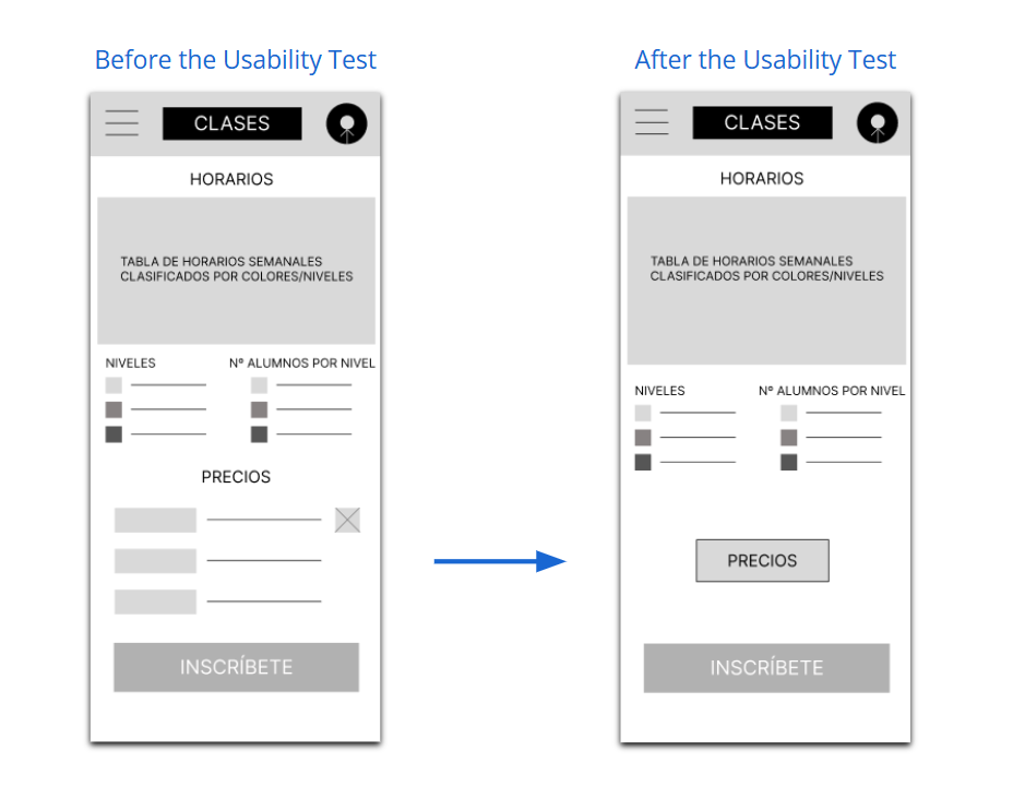
Users need to see prices clearly.
Users need at least one more step in their enrollment process.
2nd Round:
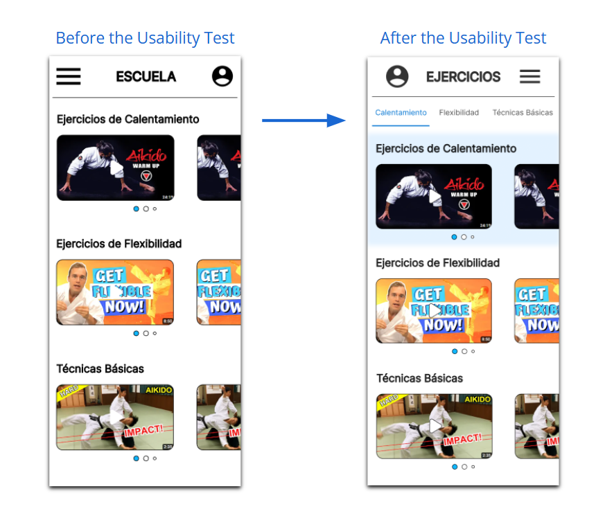
Users need to navigate easily through the content on the exercises screen.
Users need the content of the buttons to stand out more.
Refining the Designs
Mockups
After the feedback from the first study, I replaced the prices displayed on the "Classes" screen with a button that led to a dedicated page, allowing users to clearly see the different options.
Based on the feedback received from the second usability study, I added a navigation bar on the exercises screen so users could more easily access the different sections.
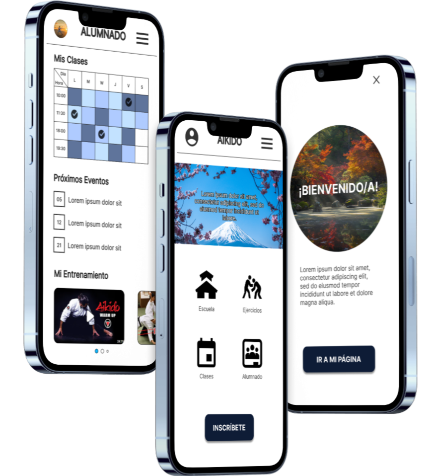
High-Fidelity Prototype
The final high-fidelity prototype incorporated modifications based on the users' needs revealed in the usability study.
Accompany the navigation icons on the homepage with text to facilitate screen reader interaction.
Increase the color contrast of the buttons to improve their legibility based on WCAG guidelines.
Provide two distinct navigation options: one through the icons on the home screen and another via a hamburger menu, allowing users to choose based on their needs.
Conclusions
Impact:
The application engages users with Aikido and encourages them to consider starting its practice.
A phrase from the users' feedback: "It's very easy to navigate the app, and it's eye-catching. It makes me curious to learn more about the school"
What have I learned:
There is a significant difference between the initial idea and the final product. Creating designs while considering various factors and the feedback from usability studies is essential to iterate until reaching a product that meets users’ needs.
Next Steps
1.Conduct a new usability study after the latest iterations to verify whether users’ needs have been adequately addressed.
2. Explore, through research, any aspects of users’ needs that may have been overlooked in previous studies.
Thank you for your attention during the presentation of this design!