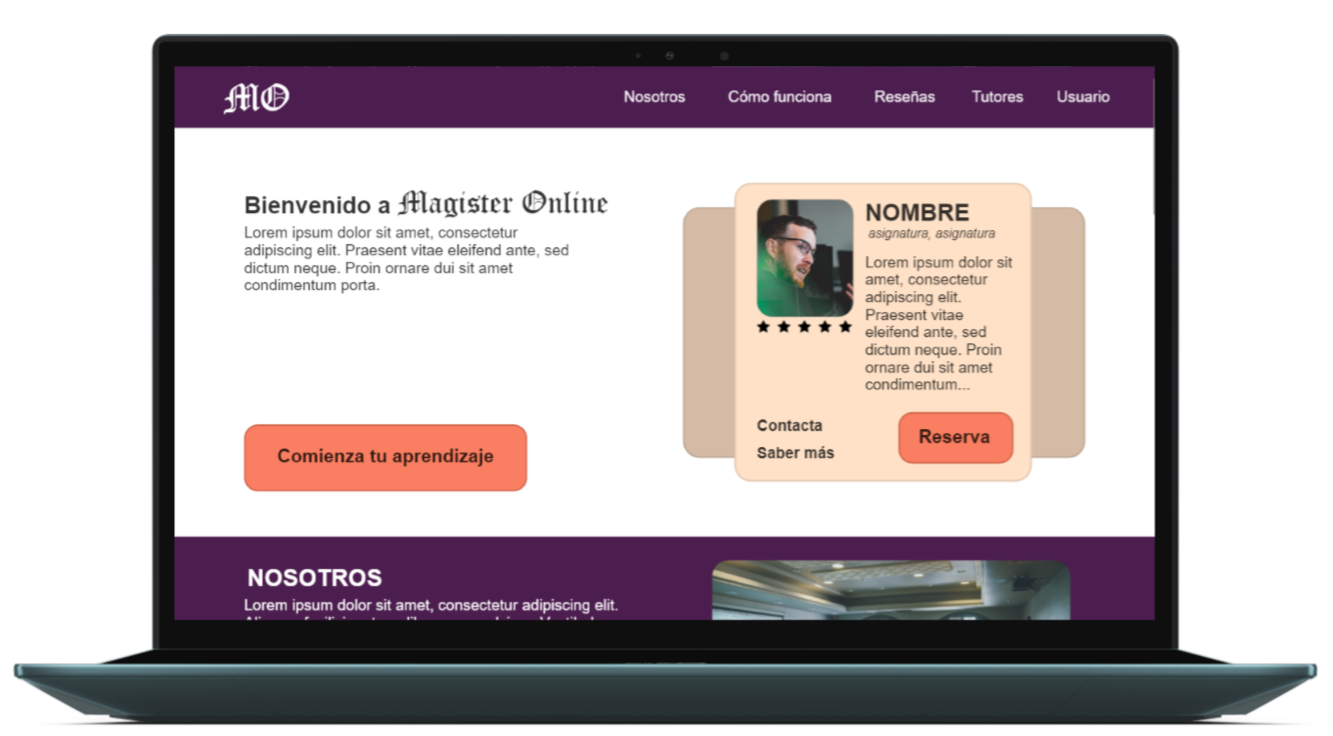
Magister Online is an online tutoring website designed to simplify the search and booking of tutoring sessions for users.
The Problem: People looking for online tutoring often have limited time and need to find trusted professionals.
The Goal: Design a website for online tutoring that makes it easy for users to book a class and find a tutor that fits their needs.
My Role:UX designer responsible for designing the main user flow screens from start to finish.
Responsibilities: Conduct interviews, create wireframes both on paper and digitally, develop low- and high-fidelity prototypes, perform usability studies, ensure accessibility, and iterate on designs.
Duration: 1 month.
Understanding the User
I began my research by interviewing users to create empathy maps that helped me better understand their needs. From the results, I identified a group of users—high school and early university students—seeking support in their studies. The main issues observed were the importance of managing their time and the need to find professional and trustworthy tutors.
Persona: Alejandra
Age: 18
Education: University
City: Cadiz
Family: Parents and sister
Occupation: Student
«If I work hard now, I will be able to help the people around me»
GOALS
Having easy access to a suitable tutor.
Being able to book or cancel tutoring sessions in advance.
Getting to know the tutors before starting the sessions.
FRUSTRATIONS
"I have a hard time finding tutors for the subjects I need"
"I'm unable to attend tutoring sessions on a regular basis"
"When I'm looking for a tutor, I don't know which one best fits my needs"
Alejandra is a student who recently started her university studies. She is facing difficulties with some of her new subjects. Additionally, she works on weekends to save money. Since she doesn’t have much time to study, she would like to have a personal tutor who can accommodate her schedule and guide her studies to improve her performance.
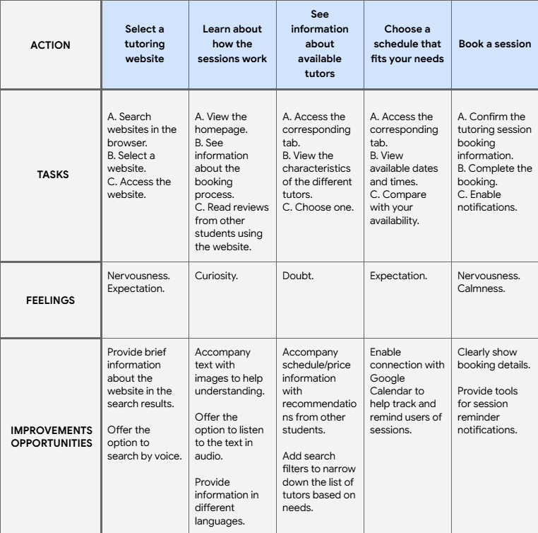
User Journey Map
To illustrate how a user would interact with the website, I based the scenario on Alejandra as she attempts to book an online tutoring session.
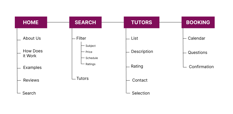
Starting the Design
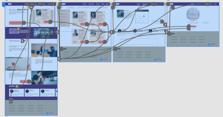
Site Map
When designing the main user flow of the website, I focused on making it easy to search for and book a tutoring session with a professional that matched the users’ needs."
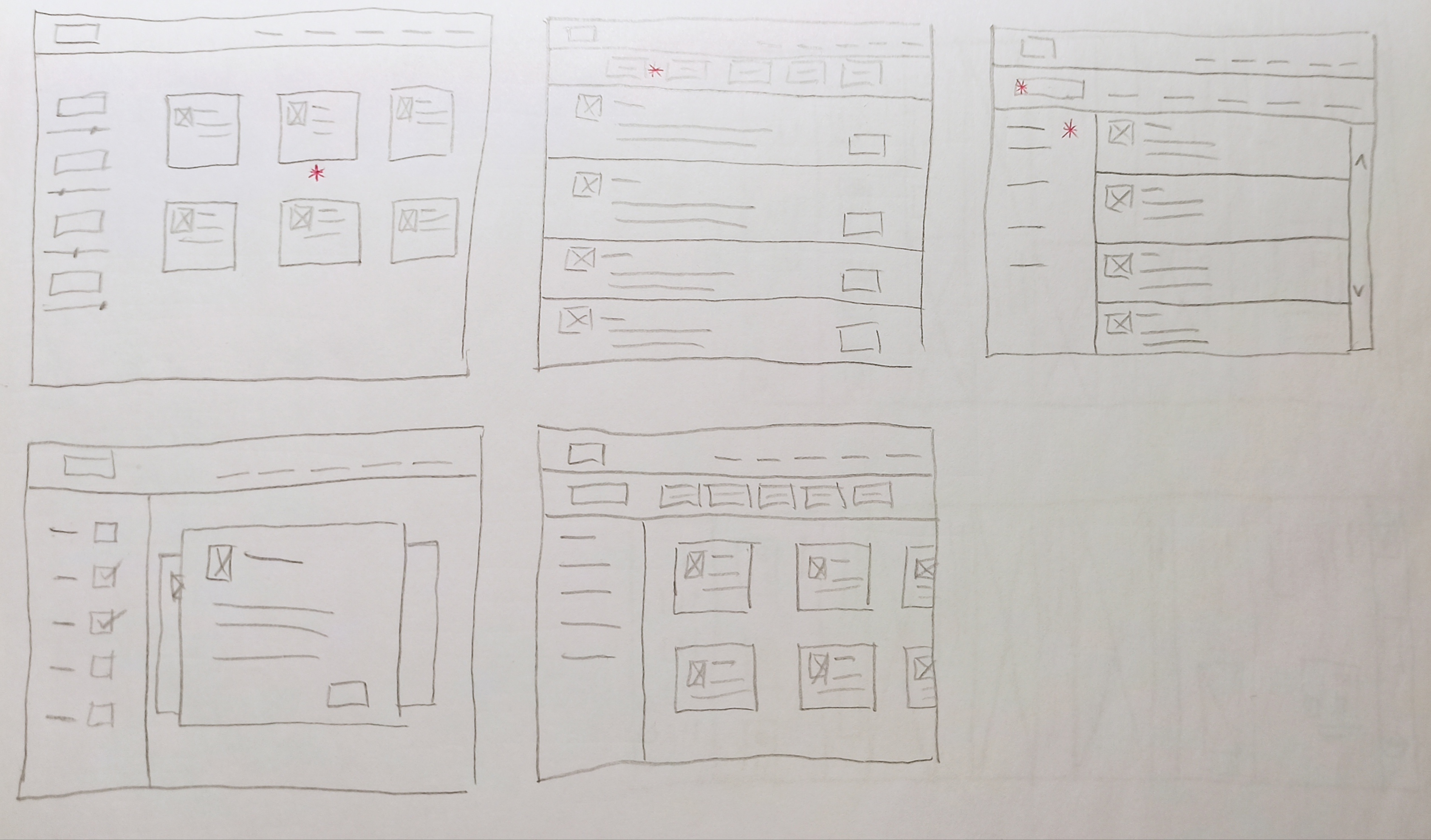
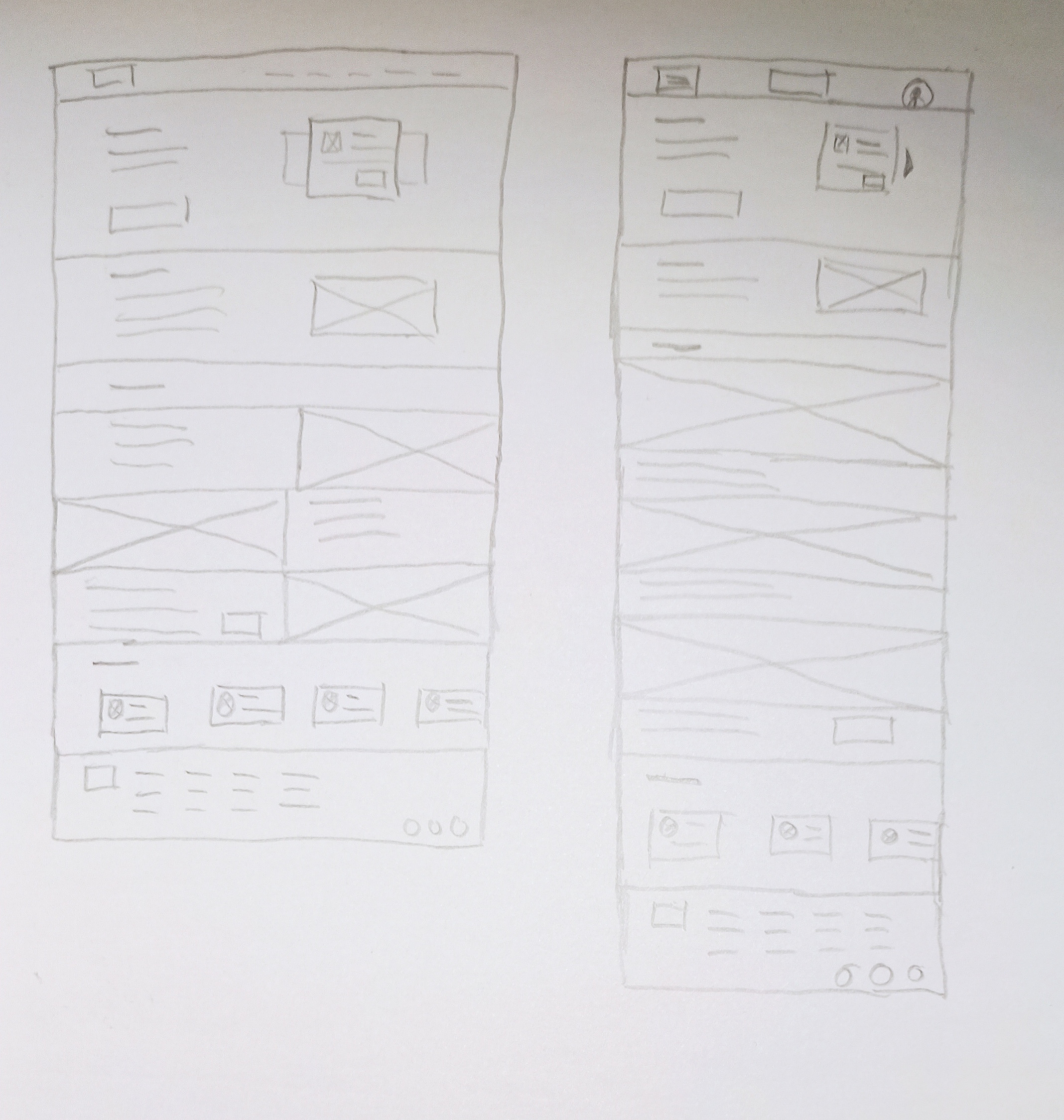
Paper Wireframes
I created initial paper wireframes to quickly explore design ideas before moving to digital format. I opted for a layout that made it easier to filter and search for information about the available tutors.
Paper Wireframes: Responsive Screens
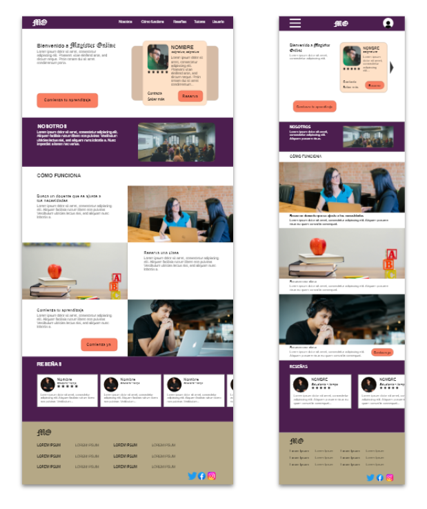
I also developed alternative screen versions to accommodate users accessing the site from different devices, ensuring a responsive and seamless experience across platforms.
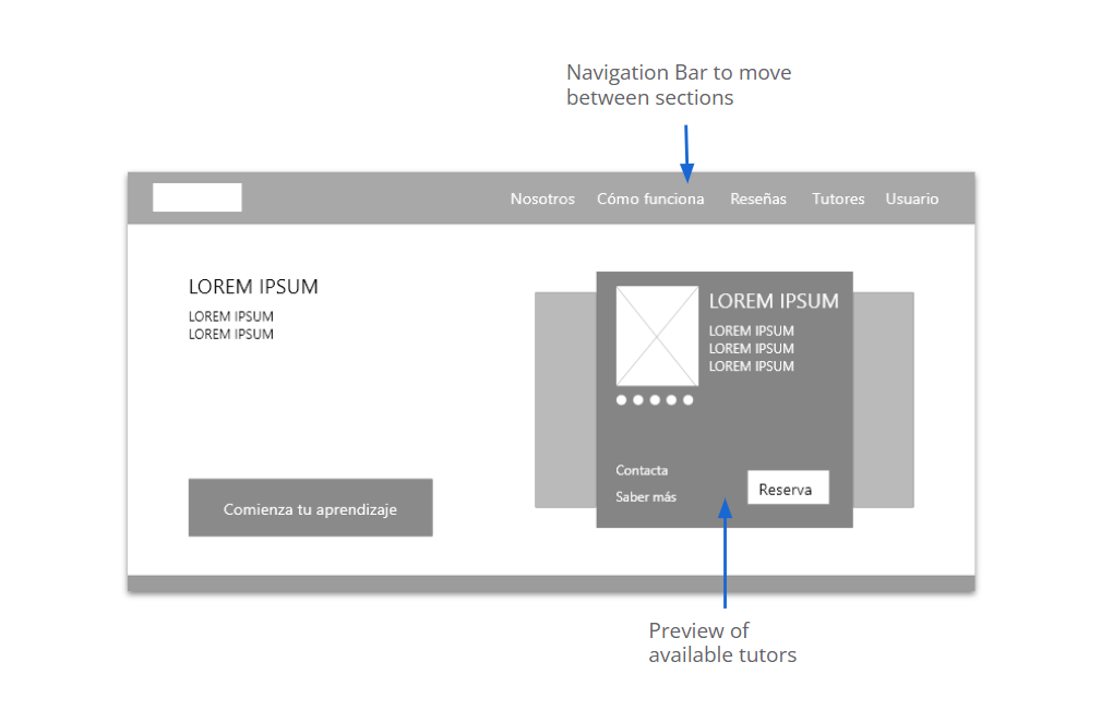
Digital Wireframes
Translating the wireframes into digital format made it easier to visualize and address the users’ needs.
I kept in mind the challenges users faced in accessing necessary information about classes and tutors.
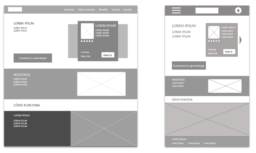
Digital Wireframes: Responsive Screens
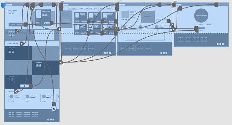
Low-Fidelity Prototype
Con todos los esquemas de página elaborados y el feedback de los usuarios, creé un prototipo de baja fidelidad. El flujo principal que diseñé fue la navegación desde el inicio de la web hasta finalizar la reserva de una sesión de tutoría.
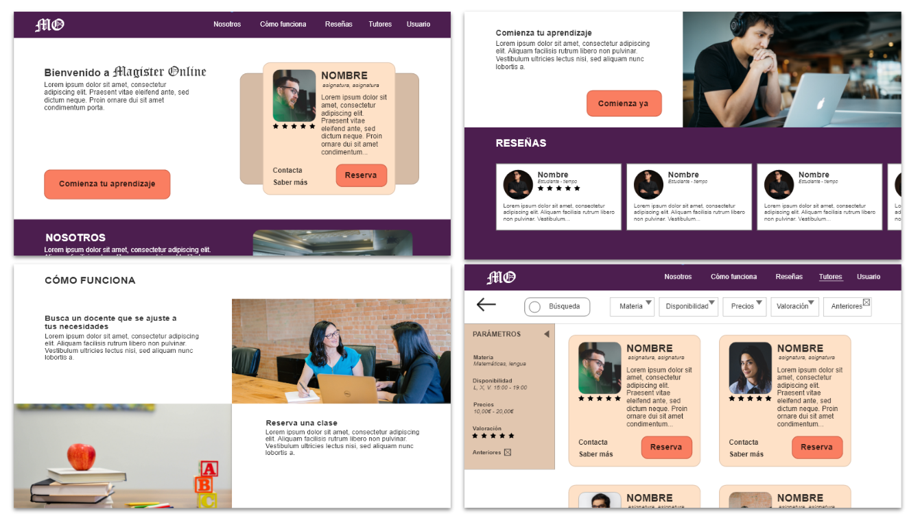
Tutors:Users want to see relevant information about tutors presented simply.
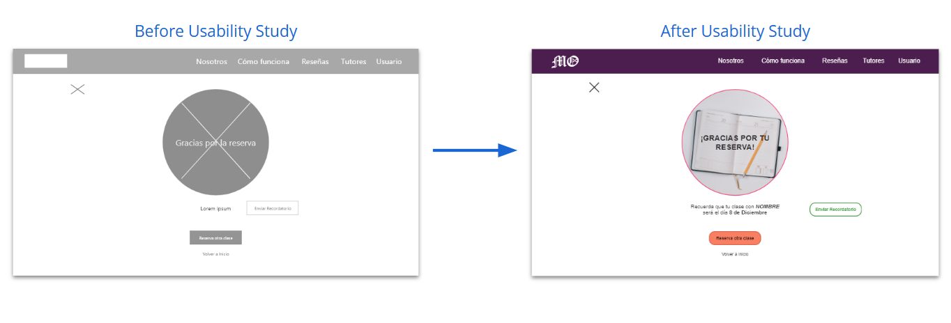
Reminder:Users prefer to receive a confirmation and reminder of their booking.
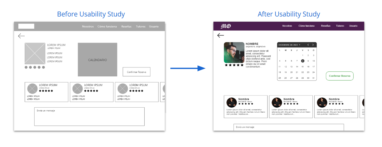
Availability:Users need to easily see the available days of the tutors.
Refining the Designs
Mockups
Based on the feedback obtained from the studies, I chose to use colors and a navigation menu in the calendar to facilitate viewing and selecting available days for the tutoring session.
To help users remember their appointment and booking details, I added a message summarizing the reservation information, highlighting the date and the tutor’s name.
Mockups: Original Screen Size
Mockups: Responsive Screens
High-Fidelity Prototype
The final high-fidelity prototype incorporated modifications based on the users’ needs revealed in the usability study, keeping in mind the ease of access to tutor information and booking.
Use typography and fonts that are easy for users to read.
Increase the color contrast of the buttons to improve their legibility based on WCAG guidelines.
Use headings of different sizes to improve visual hierarchy clarity..
Conclusions
Impact:
Users mentioned that they found it easy to navigate the website. Additionally, they said that the filtering options available helped them find a tutor that suited their needs.
What have I learned:
One of the lessons learned from this project is that nothing should be taken for granted—even the most common elements can be overlooked. That’s why it’s important to pay close attention and continuously iterate on designs, always keeping users’ needs in mind.
Next Steps
Conduct a new usability study after the latest iterations to verify whether users’ needs have been adequately addressed.
Explore, through research, any aspects of users’ needs that may have been overlooked in previous studies.
Thank you for your attention during the presentation of this design!